The brief
Game Lounge is an affiliate company with more than 80 brands under it. The parent brand had grown faster than its identity: the old logo was dated and carried little meaning. It needed a refresh modern enough to stand out, and strong enough to sit above a large, varied portfolio.
The approach
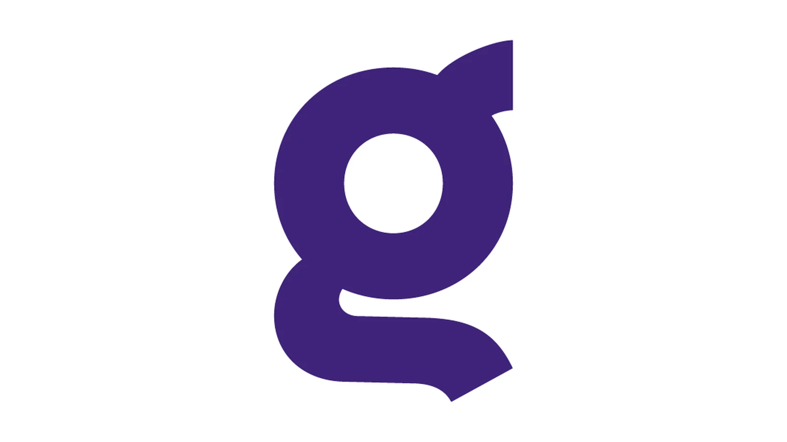
A genuinely collaborative rebrand, a team of six designers working it through together, myself among them as a senior designer at the time. We went back to the drawing board many times over several months before landing on a direction everyone stood behind: a bold, modern identity built around a strong, personalised "g" mark and a confident new colour palette.
The outcome
The full rebrand shipped, from the new "g" mark and colour system through to the applications across the group. It gave Game Lounge a modern identity with real meaning behind it, made to stand out in a crowded affiliate market and to hold its own above 80+ brands. Getting six designers to a unanimous decision is its own result: everyone owned it, so it stuck.
This write-up is still a working draft.